

Time Timer
Time Timer Client UX Research Project
Role: Researcher, UX Designer
Timeline: Spring 2026
Tools: Figma, Trello, Miro, Excel


Overview
Time Timer is a client UX research and design project completed in collaboration with the Redhawk Design Collective and the Time Timer team. Through user interviews, usability testing, and iterative design, our team explored opportunities to improve onboarding, navigation, widgets, Live Activities, and Apple Watch interactions. My primary contributions focused on the navigation experience, including planning and facilitating usability tests, synthesizing research findings, and designing Figma prototypes for the home screen, timer editing, grouping functionality, and preset timer interactions to improve discoverability and reduce cognitive overload.
Design Timeline/Process
-
Kickoff Presentation
-
Semester Design Proposal
-
Competitor Research, In-Depth Interviews & Usability Testing
-
Individual Team Client Meeting #1
-
Insights, HMW's, & Ideation
-
Individual Team Client Meeting #2
-
Sketches
-
Low Fidelity
-
High Fidelity
-
Final Presentation & Client Meeting #3
Kickoff and Proposal
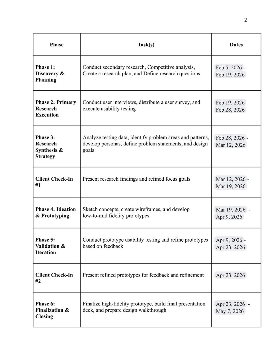
The project began with secondary research on Time Timer, allowing us to familiarize ourselves with the brand, its users, existing features, and the competitive landscape before meeting with the client. Based on our research, we developed a list of questions to better understand the company's goals, current challenges, and expectations for the project. This preparation helped us make the most of the kickoff meeting and ensured we entered the conversation with a strong understanding of the product.
During the kickoff presentation, the Time Timer team introduced the company, walked us through the current app experience, and shared the UX challenges they hoped we could help solve. Following the meeting, we created a project proposal that outlined our objectives, research methods, deliverables, and timeline for the semester. Establishing this plan early gave our team a shared direction and served as a roadmap for the remainder of the project.



Competitor Research, In-Depth Interviews & Usability Testing
Following the kickoff meeting, we divided our six-person team into two research groups: In-Depth Interviews & Competitor Analysis and Usability Testing. While each group focused on a different research method, we shared the common goal of better understanding users' needs and identifying opportunities to improve the Time Timer experience before moving into design.
The In-Depth Interviews & Competitor Analysis group developed a semi-structured interview guide focused on participants' time management habits, onboarding experiences, notification preferences, and perceptions of visual timers. These open-ended conversations were designed to uncover user motivations, pain points, and behaviors that could not be observed through task-based testing alone.
As part of the Usability Testing group, I collaborated on creating a structured testing script that evaluated how participants navigated the existing Time Timer app. The script included first impressions, a think-aloud protocol, realistic task scenarios, and post-test reflection questions that encouraged participants to explain not only what they were doing, but also how they were thinking and feeling throughout the experience. By combining observational tasks with follow-up questions, we were able to identify usability issues related to navigation, onboarding, timer creation, editing, grouping functionality, and overall discoverability.
Together, these two research approaches allowed us to collect both behavioral data through usability testing and attitudinal insights through interviews, giving our team a well-rounded understanding of the current user experience before beginning the design process.


Conducting Tests & Analyzing Findings
With our research materials finalized, each team member conducted one usability test and one in-depth interview. Once completed, participants' interview transcripts and usability testing recordings were uploaded to a shared Google Drive, allowing the team to collectively analyze our findings.
After data collection, we divided into our research groups once again, with each group using a different approach to synthesize the information. The In-Depth Interviews & Competitor Analysis group imported interview quotes and observations into Miro, where they organized the findings into an affinity map to identify recurring themes, user needs, and pain points across participants.
Meanwhile, the Usability Testing group took a more quantitative approach. Each team member documented their participant's performance in a shared usability testing tally sheet, recording successes, errors, and areas of confusion for every task. By combining our results, we were able to identify which tasks consistently caused users difficulty and which interactions participants completed successfully with little or no confusion.
Once our analysis was complete, we combined both groups' findings into a research presentation for our first formal client meeting with the Time Timer team. The presentation summarized our key insights, usability findings, and emerging patterns while highlighting the opportunities we believed would have the greatest impact on improving the app. Presenting our research early in the process gave the client an opportunity to validate our findings, provide additional context, and ensure we were moving in the right direction before transitioning into ideation and design.


Insight Statements, HMW's, and Ideation
After presenting our research findings, we shifted our focus from identifying problems to exploring potential solutions. Working within our respective research groups, we transformed the themes that emerged from the in-depth interviews and usability testing into insight statements that captured the most significant user needs and pain points. Each group developed five insight statements, along with a corresponding How Might We question to reframe those findings as opportunities for design.
Once both groups had completed this process, we came back together to review, refine, and combine our work. Together, we selected the five strongest insight statements and How Might We questions that best represented the challenges users experienced throughout our research. These became the foundation for the next phase of the project.


To encourage divergent thinking, we then created a shared Miro board where each team member contributed at least 10 solution ideas for every How Might We question. This brainstorming exercise challenged us to explore a wide range of possibilities before narrowing our focus, resulting in dozens of concepts that addressed navigation, onboarding, widgets, Live Activities, and overall usability. The finalized insight statements, How Might We questions, and ideation concepts were then presented during our second client check-in, where we gathered feedback before moving into wireframing and prototyping.

Sketches
After brainstorming ideas and reviewing them with the client, we divided into smaller teams to begin the design phase, with each group focusing on either onboarding, navigation, or widgets/Live Activities. Using our insight statements, How Might We questions, and client feedback as a guide, we sketched a variety of concepts to explore different approaches before selecting the strongest ideas to develop further in Figma. This iterative process allowed us to refine our solutions before investing time in low-fidelity desigins.
Navigation


Widget/Live Activity


Onboarding


Low/High Fidelity
Following our initial sketches, we began translating our ideas into low-fidelity prototypes in Figma. This stage allowed us to visualize our concepts and begin testing how the redesigned onboarding, navigation, and widget experiences would function before refining the visual design.
One challenge we encountered was rebuilding the existing Time Timer interface from scratch. Early in the project, we were told we might receive the client's Figma files to use as a starting point. However, those files never became available, requiring us to recreate many of the app's components ourselves. While this made the process more time-consuming, especially as I rebuilt the navigation system, it also strengthened my Figma skills and gave me a much deeper understanding of designing within an existing design system.
Once the low-fidelity prototypes were complete, each team member conducted another round of usability testing with a new participant to evaluate whether our redesign addressed the usability issues identified during the first round of research. Using an updated testing script, we gathered feedback on the redesigned onboarding flow, navigation, widgets, and Live Activities to determine what worked well and where users still experienced confusion.


After synthesizing the results, we identified additional opportunities for improvement, including clearer group timer terminology, more intuitive timer creation, stronger system feedback, and simplified preset timer interactions. These findings guided our final iterations as we refined the low-fidelity concepts into high-fidelity prototypes that better aligned with user expectations and client feedback.
High Fidelity
After completing our high-fidelity prototypes, we conducted one final round of validation with the same participants who tested our redesigned concepts. Rather than repeating the full usability test, we asked a series of targeted follow-up questions to better understand whether our design revisions addressed the issues identified during earlier testing and if any areas still felt confusing or could be improved. This final round of feedback gave us confidence that our solutions better aligned with user expectations before finalizing the designs.
Navigation


Widget/Live Activity

Onboarding

Final Presentation
For our final presentation, we worked together to develop the presentation slides and script, ensuring we clearly communicated our research process, design decisions, and final recommendations. Once finalized, we presented our work to the Time Timer team alongside the second Redhawk Design Collective group, giving us the opportunity to compare how two teams, working from the same client brief and research process, arrived at different design solutions.
One of the most interesting takeaways was seeing how differently each team interpreted the research. While our team chose to preserve the overall look and feel of the Time Timer app by improving its navigation, onboarding, and core interactions, the other team took a much more transformative approach, reimagining the platform with an entirely new interface and user experience. Seeing both approaches reinforced that there is rarely one "correct" solution in UX design, and that different perspectives can lead to equally valid outcomes.
Overall, this was one of my favorite projects throughout college. It gave me the opportunity to work with a real client, conduct research with actual users, and experience the full UX design process from discovery and usability testing to iterative design and client presentations. After previously learning many of these concepts in an online UX research course, applying them in a collaborative, real-world setting strengthened both my confidence and my passion for UX research and design.


